The Importance of Wireframing in Web and App Development
Without a strong structure, you cannot develop a successful website or mobile app. If you wish to have an exceptional foundation upon which you can build your project, wireframes are your cue. Building a wireframe is one of the most fundamental steps in the UX design process. But, if this is the first time that you have heard about them, or want to know more about their types, importance, and advantages, do not worry. We have got you covered. Give this article a thorough read so that you or your designer can start working on a wireframe to make your website or app a money-spinner.
What are Wireframes:
Wireframes might seem tricky and complicated, but in essence, a wireframe is an easy-to-describe concept that makes web and app development much easier.
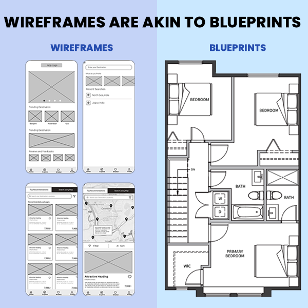
Before we go into the depth of our topic, consider an example of the construction of a house and the role of architecture in it. Before you hire builders and start the construction, you ask an architect to make a blueprint that demarcates the entire house and gives the builders a basic idea of how they are supposed to construct the house. The workers do not have the professional proficiency to make a blueprint, neither can they construct a whole house without it.
If we relate our topic to this example, the last house is the fully developed mobile app or website, the workers are coders, and the architect’s blueprints are the wireframes. So basically, a wireframe is the layout of the final product that gives the coders and developers insight into how they are supposed to design the frontend. It is a navigational scheme that represents the visual layout of the website or app and is often called the skeleton outline.
Notice the similarity between the two?
A website or an app will always be a real success if you consider every aspect of it. You have to take both the functionality and the user interfaces layout side-by-side. You can not just focus on the code and how smoothly it runs while ignoring the website’s or app’s visual layout. You can not leave the exterior of the house unattended. To make your website or app a big hit and retain your users, you will have to develop a seamless backend with an engaging, visual frontend. And without a basic blueprint and a skeleton outline.
Let’s discuss some technicalities and minor details of wireframes before focusing on their importance and advantages in mobile app and web development.
Types of Wireframes:
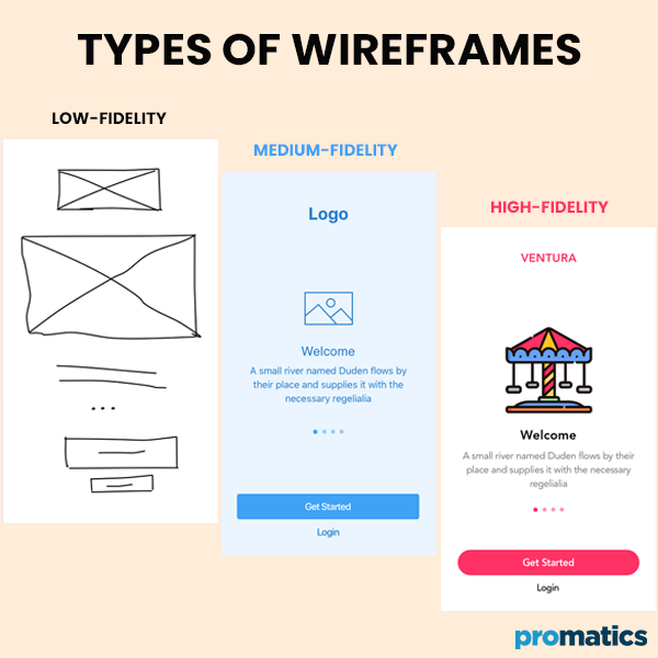
There are 3 main types of wireframes, and the distinguishing factor between these three is the amount of detail, complexity, and number of features they use.
I. Low-fidelity wireframes:
The simplest type of wireframe is the low-fidelity one. Often, this type of wireframe is drawn and sketched in black and white on a piece of paper. Design experts usually ignore grid, scale, and pixel and use features such as block shapes, squares, lines, simple images, and Latin filler text for labels and content.
The main aim of low-fidelity wireframes is to give the developers a conceptual sense and narrow down different options to a final layout.
II. Medium-fidelity wireframes:
Medium-fidelity or mid-fidelity wireframes are the most common types of wireframes that give a more detailed and accurate layout of the design. Medium-fidelity wireframes are mostly made using various digital tools, such as InVision, Balsamiq, and Sketch. Like low-fidelity wireframes, this type of wireframe also uses black and white colors, but you can also use different shades of gray to differentiate between the importance and prominence of each feature. To divide the body into different segments, you can also text weights that vary.
These wireframes have great use in the initial stages of the project, where they help adjust additional features and functionality along with the main features.
III. High-fidelity wireframes:
And lastly, the high-fidelity wireframes. Unlike the other 2 types of wireframes, this type uses different colors for actual images along with written content to make a ready-made replica of the product. Their increased level of detail makes them the perfect pick for better documentation of complex concepts. Furthermore, these wireframes make exploring interactive maps and menu systems much easier.
Difference between Wireframing Websites and Mobile Apps:
Up until now, we have talked about the general information and use of wireframes. We will talk about the differences to consider while making wireframes for laptop websites and mobile apps.
a.) Interaction:
Due to significant differences in the functionality of laptop websites and mobile apps, the user interaction also differs between the two. For instance, mobile apps have an additional feature of downloading content for offline usage, while websites pull their content and data from the internet and seldom have the “offline mode” feature. This difference should be kept in mind while developers make wireframes.
b.) Behavior:
A laptop website does not behave in the same way that a mobile app does. In laptops, you have to scroll through the website with the help of a mouse or trackpad and open a certain feature or button you have to click on it. Some websites have a distinctive attribute that reveals or opens additional information whenever the user hovers the mouse over it. On the contrary, mobile users have to tap on the screen. Since the user behavior does not resemble both scenarios, developers have to make changes while making wireframes for laptop websites and mobile apps.
c.) Size:
Screen width, length, and size are important factors that force developers to make different wireframes for websites and mobile apps. Various websites have a layout that displays their data in several columns, whereas mobile apps mostly have a single or, at max, two columns. Another important consideration that you should make is the number of items displayed on the screen. For better optimization and visual effects, design experts make different wireframes for laptops and mobiles.
Advantages of Wireframing:
Let’s talk about its advantages to understand better the importance of wireframing in website and app development.
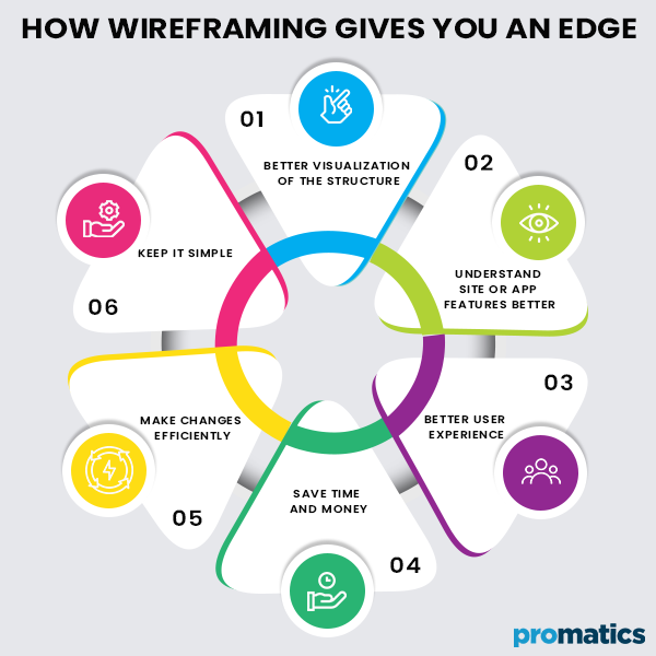
1. Make Changes Efficiently:
The front end of your website or app will require design changes. No matter how perfect you think your layout looks, readjustments are inevitable. And in the case of full-blown web page design, these tweaks can prove very complicated and take days or even weeks. It is why developers prefer using wireframes. Want to increase the size of a header? Not a problem. Think the logo is not a perfect fit? Take 5 minutes to get it done right this time. And that too without stopping or putting further development at a halt. Sometimes, a product is released before it is properly tested. Making changes to the full-fidelity design can cost a company millions of dollars and potential customers for good. For this reason, wireframing can make changes efficiently by saving both time and money.
2. Better Visualization of the Structure:
You can not properly work with the design structure in your head unless you lay it out in hard or soft copy. And the best way to visualize it is by making a wireframe. Fresh, raw ideas require constant tweaks and continuous modifications that you can only do in a wireframe. Moreover, if you wish to bring a client or another party to the same page as yours, they will want to see a prototype or a model of the project, or better yet, a wireframe.
3. Better User Experience:
If you want your brand or company to stay ahead of your competitors, user experience is key. Users should have a great interaction with the software, use the entire project effectively, and navigate through it comfortably. An engaging user interface helps attract potential customers and retain old ones. If you use wireframes, you can test everything, make changes, and look at things from the user’s perspective. As a result, you will be sending out a message to potential customers and your competitors that you put user experience above everything else. Companies and developers that do not use wireframes do not push usability to the forefront as they can not showcase page or app layouts at their core.
4. Keep Clients in the Loop:
If the laptop website or mobile app is not your own, your client will want and need the constant satisfaction that their project is in good hands. If you treat wireframes like a prototype, you can foster client involvement. With wireframes, you and your client can focus solely on how the website or app will work instead of how it will look. Additionally, your web design experts can prepare a prototype quickly to persuade the client to get on board as early as possible. If you want your client to focus on their needs and help them achieve their goals, wireframes are the way to do it.
5. Understand Site or App Features Better:
Every app or website requires updates, innovations, and new features. If you have added a new feature or introduced a new code in the backend, using wireframes can help you better understand that feature and how it will work with your user interface. If your client is confused about the new feature or where it will be positioned on the website or app, wireframes can prove to be very helpful and influential. And once you and your client are content with the new feature, the confidence boost can do both parties a great deal of good.
6. Save Time and Money:
To stay in a competitive market, you have to use every tactic and tool in your arsenal to save time and money. We just discussed that wireframes help you make changes more effectively and efficiently, which has both a short-term and a long-term impact on saving time and money. Changing web or app designs can take a lot of time. Wireframes are easy to change, which is why they also prove economical on a short-term basis. Moreover, the designer and developer get a better knowledge of the entire project, which reduces the chances of any future errors, which is the long-term impact.
To-Dos while Creating Wireframes:
Now that you know the importance of wireframing in web and app development, here are some tips that can help you create wireframes:
Keep it Simple:
Since the basic function of using wireframes is to give a rough idea about the webpage or app design, keep them simple. Instead of using colors, use gray tones to differentiate between individual segments. Using images can distract your developers and waste a lot of precious time. Instead, draw a box with the same dimensions of the image and label it “X.” Many developers make things complicated for them by using different fonts and sizes for different headers. Do not focus on typography, and use a single generic font to keep things simple and functional instead of pretty.
Choose the Right Tools:
The best way to start designing a wireframe is with the help of pen and paper. Once you have got the right layout, start creating a document, and use any popular wireframing tools that you are most comfortable with. Some designers are more comfortable with Microsoft Visio, while others have more experience using Adobe Designers Fireworks. Balsamiq is a great tool for wireframing and is mostly used by designers. Refrain from creating HTML, as it can prove to be a distraction.
A wireframe is a simple blueprint or layout of a user interface. Whether you are developing a website or mobile app, using wireframes can prove very helpful and make things very convenient for you. There are 3 types of wireframes, among which mid-fidelity or medium-fidelity wireframes are the most commonly used. Even though there are different wireframes for websites and mobile apps, they have numerous advantages for both the developer and the client. While making them, make sure you keep things simple and use the right tools.
Still have your concerns?
Your concerns are legit, and we know how to deal with them. Hook us up for a discussion, no strings attached, and we will show how we can add value to your operations!


