Smart strategies for optimizing your ecommerce mobile app checkout
Designing the best checkout experience that performs in the best way is something that can’t be learned overnight. Context is the key to design a great user experience when launching e-commerce development project. It is a must for e-commerce app developers to focus on checkout page optimization. Checkout is an important process where the customer makes the decision.
Online retailers must remember that the requirements of mobile users are quite different from desktop users. They are likely to come across several distractions such as messages, notifications, phone calls, lack of Wi-Fi signals etc. Sometimes, the smaller screens and fiddly keyboard might spoil the user experience. It is important for developers to build a user experience that is tailored to overcome these challenges.
Online buyers often leave the e-commerce app or site before completing the checkout process. It is estimated that the total amount of items left in shopping cart every year is going to be around $5 trillion. More than 50% of customers are likely to leave the items in cart due to poor experience or difficulty in using the app. In short, poor checkout process tends to drive away the customers.
If you want to increase mobile conversion rates, you must ensure the tips described below are built into your mobile checkout process.
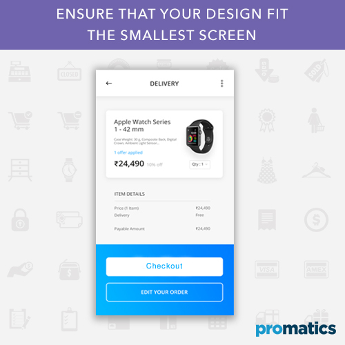
Tip 1 – Ensure that your design fit the smallest screen
Mobile app industry is constantly evolving and app developers are looking for ways to maximize mobile conversions. E-commerce app developers need to adopt the mobile first approach and then design the app for large devices to achieve the best design. You can start by designing the essential features and gradually cover all the hardest scenarios. Some designers go with an opposite strategy by squeezing the content into a small screen.
E-commerce app developers must understand the difficulties associated with small screen devices. The visitors should be able to tap with the finger easily. The fonts must be made large enough so that customers can read the text without much effort. It is vital to make optimum use of each and every pixel.
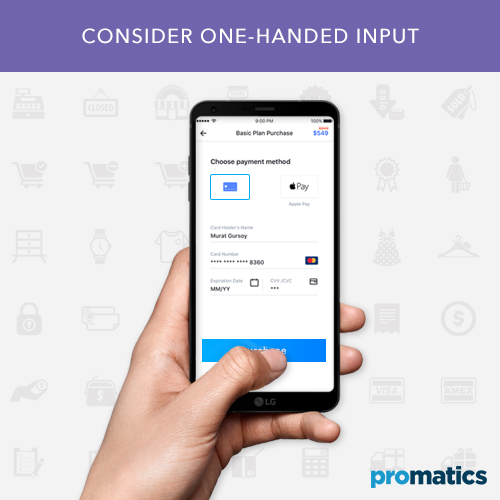
Tip 2 – Consider one-handed input
Smartphone often uses their devices in different ways. The way a user holds their phone present a challenge to the developers. According to the research conducted by UX Matters, it was found that more than 40% of users use one hand and 15% users use two hands.
It is a challenging task for one-handed users as one touch is limited. Thumb plays a vital role in enhancing the screen touch experience. If we see from the context of e-commerce checkout, it is important to place important elements in easy and ok areas of the screen. The use of scrolling feature makes it difficult to reach easy and ok areas.
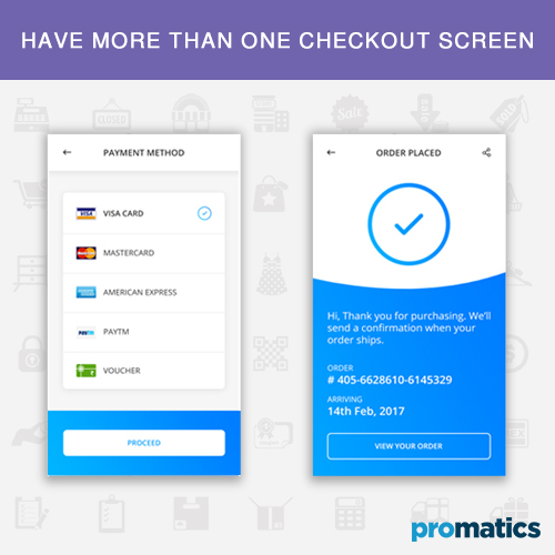
Tip 3 – Have more than one checkout screen
When it comes to desktop apps, it is better to have more than one checkout page. More checkout pages will actually benefit e-commerce mobile apps. It is important to eliminate scrolling on mobile e-commerce sites and keep clicks to a minimum. The e-commerce pages should contain all the necessary inputs right on the screen. It is better to add multiple pages if more than one screen information is needed.
As said before, typing text on mobile devices is a challenging task, as it tends to be much slower on touch screens than desktops & laptops. Shoppers would be browsing the app, choosing multiple options and pressing the buttons before getting to the checkout page.
Breaking the form into multiple pages will take only half of the screen. You can ensure that the visitors are not intimidated by keyboard entry requirements by adding a “Next” button.
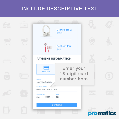
Tip 4 – Include descriptive text
One of the main reasons why people give up purchase is that they fail to complete a form. App designers must create usable forms that defeat this obstacle. Descriptive texts always come in handy, wherever they want to be placed. If your e-commerce app has complex text, it should be hidden behind tooltip that generates the content.
Although this is a simple tip, it will help you increase the conversion rate significantly. Avoid using text that has no relation to the products. Your shopper should recognize the description that attests to the quality of your products. Apps with explicit content, titles, icons, and descriptions will not be accepted by search engines.
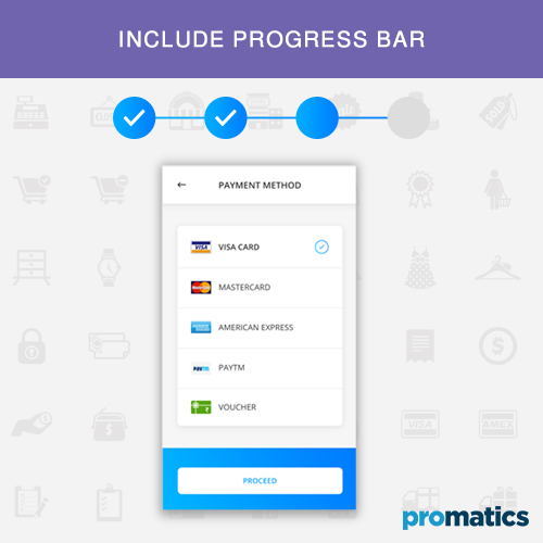
Tip 5 – Include progress bar
Online shoppers want to know where they are and where they are going. Progress bar helps them know these details and how much longer until they are done. According to recent studies, progress bars alleviate interest and curiosity in users. The majority of e-commerce stores show a bar that leads the users through the process.
Mobile users leave the app if it takes more than 5 seconds to load. Users must be convinced that it is the right thing to do and they are getting out of their way. app developers can use testing tools to optimize loading times and progress bars.
Bottom line
Check out pages play an important role in enhancing user experience. Sometimes, mobile app developers ignore it and craft a simple checkout process that generates leads and maximizes conversion.
When it comes to e-commerce apps, security is another important concern. Numerous brick-and-motor retailers have suffered serious security issues that exposed confidential information of the consumers. To overcome this issue, app developers must enable HTTPS and encryption that help customers feel safer.
Smartphones are likely to stay for years, presenting new opportunities and challenges for app developers. Mobile checkout process must be optimized just like other aspects of mobile app development to increase conversions.
If you have an ecommerce app development idea, we are here to help you. Contact us today with your requirement!
Still have your concerns?
Your concerns are legit, and we know how to deal with them. Hook us up for a discussion, no strings attached, and we will show how we can add value to your operations!
